ImmoScout24 is a real estate platform in Germany helping people find a home. They wanted to find a solution that extends support to users beyond the initial property search and that’s where LivingPlus was born.
In the journey towards its official launch, LivingPlus (WohnenPlus) underwent a strategic soft launch in early January 2023.
Faced with less-than-expected engagement and subscriptions during its initial phase, my role as a UX designer became pivotal in unraveling the reasons behind user hesitancy. The challenge presented an opportunity to delve into user insights, identify pain points, and improve and elevate the LivingPlus experience.
As UX designer, I collaborated with a multi-faceted team of technical developers, a product manager, and a researcher and was responsible for the product’s UX strategy and UI design and co-led user testing.

"I wish I had known about this at an earlier point, while I was still subscribed to my search membership or after getting my contract"
"I wish I had known about this at an earlier point, while I was still subscribed to my search membership or after getting my contract.
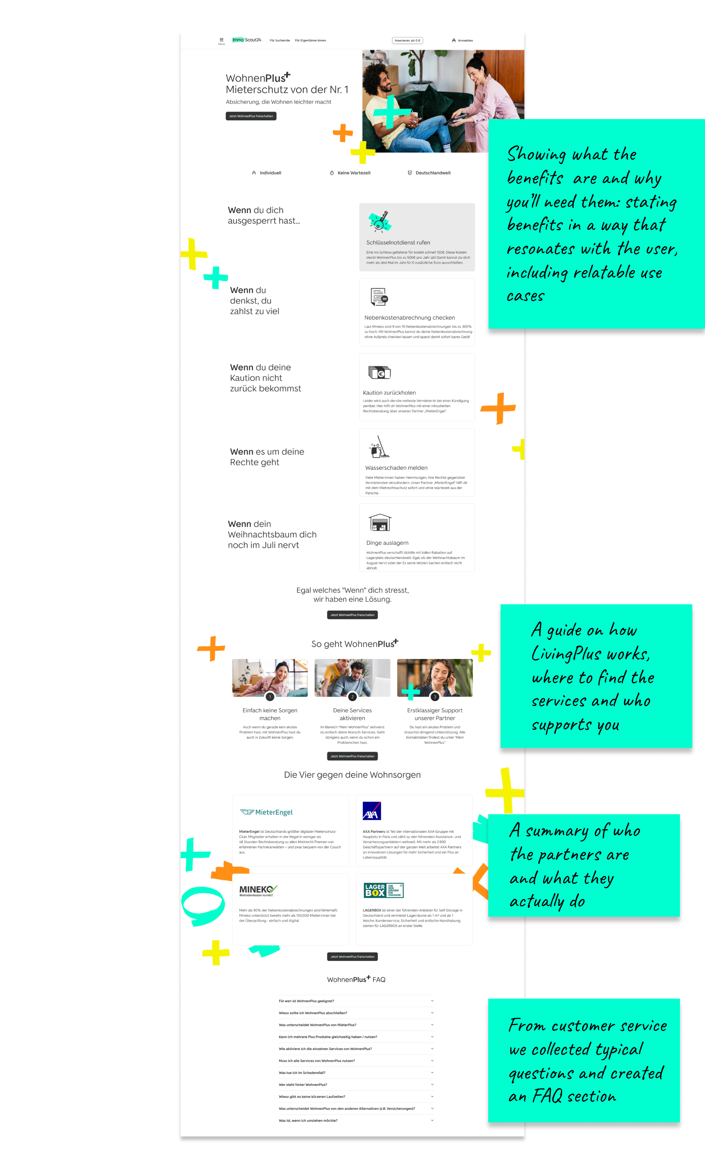
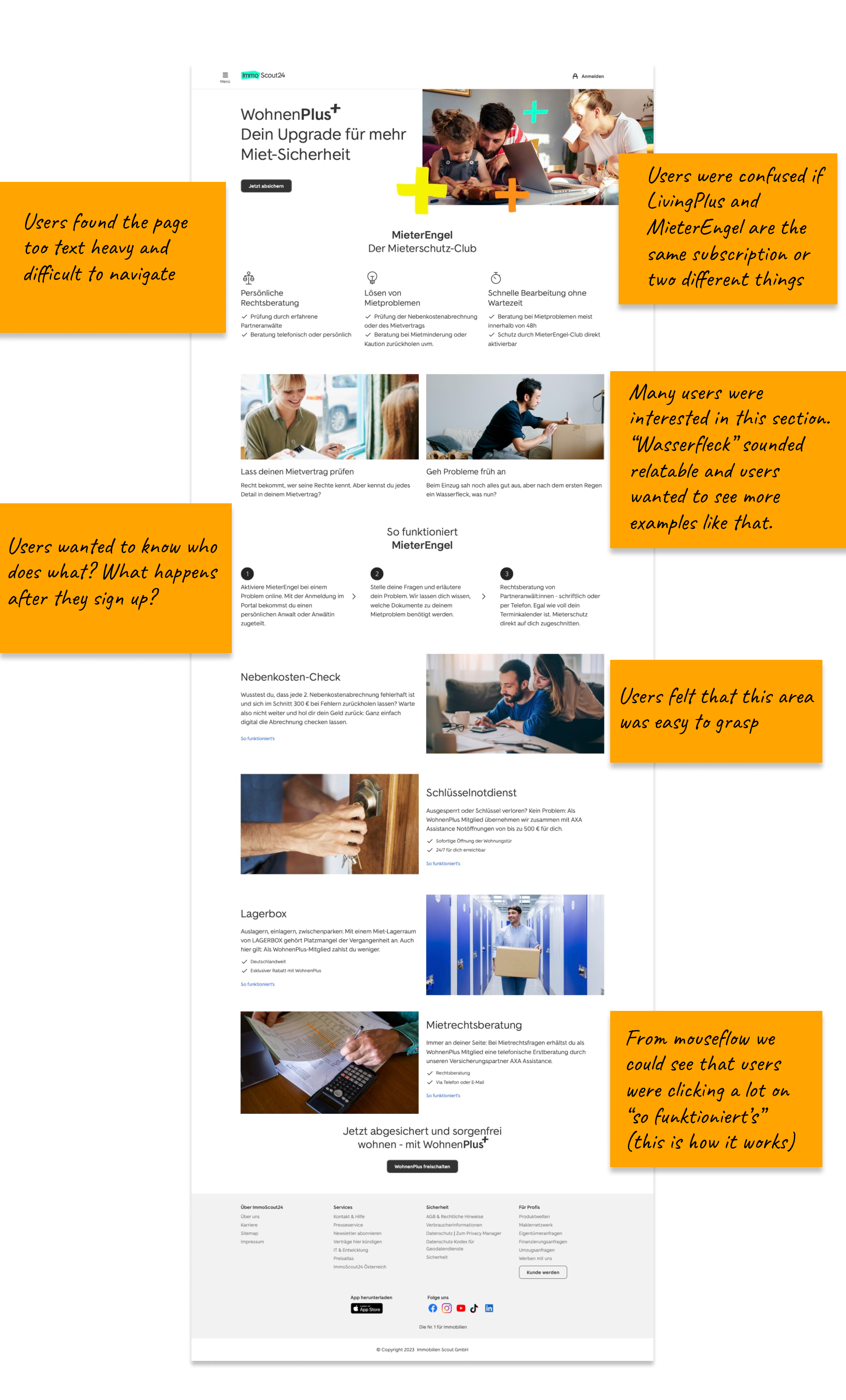
"I am a German speaker and I still think the words are not simple or relatable to understand the features, maybe even examples would help."
We gathered the insights from the user testing and prepared a 2-hour workshop with the team to share our insights and brainstorm new ideas. We first came up with “How might we” statements and our winner was: How Might We offer LivingPlus at the right time in the user journey and bring more visibility to it before and after purchasing?
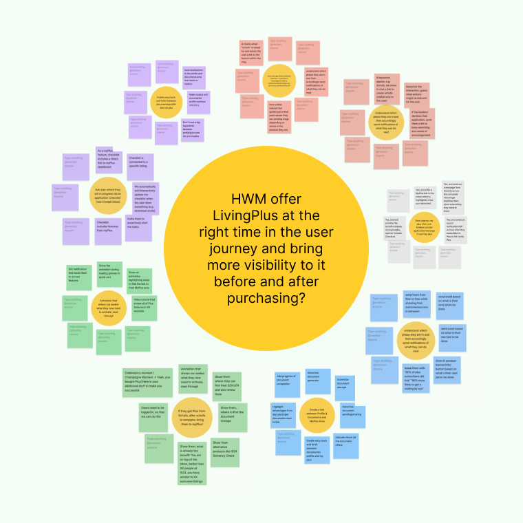
To generate solutions we employed the Lotus Blossom exercise where we propose related ideas tackling the HWM as a group, then individually take ideas and expand on them further. We kept blossoming until our 10 minutes were up. We dot voted on the best ideas, then drew our user journey and identified where in the journey those solutions could be implemented.
We developed a list of solutions and drew a timeline to implement them, providing enough time for A/B testing and seeing results for each solution on its own to see if it is working out.
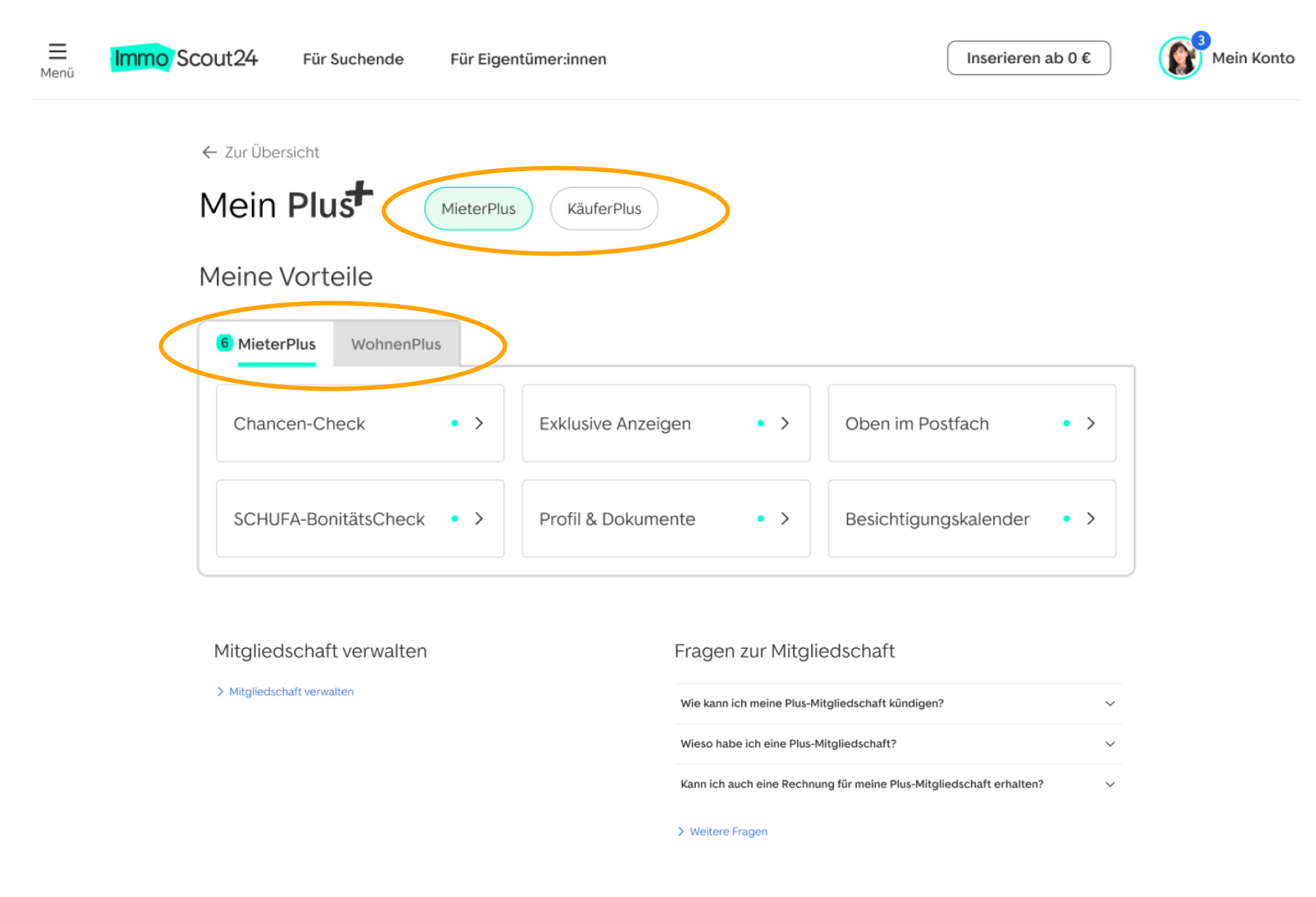
Before: Users were confused that LivingPlus didn't have its own chip in the navigation and could only be found under the MieterPlus chip.
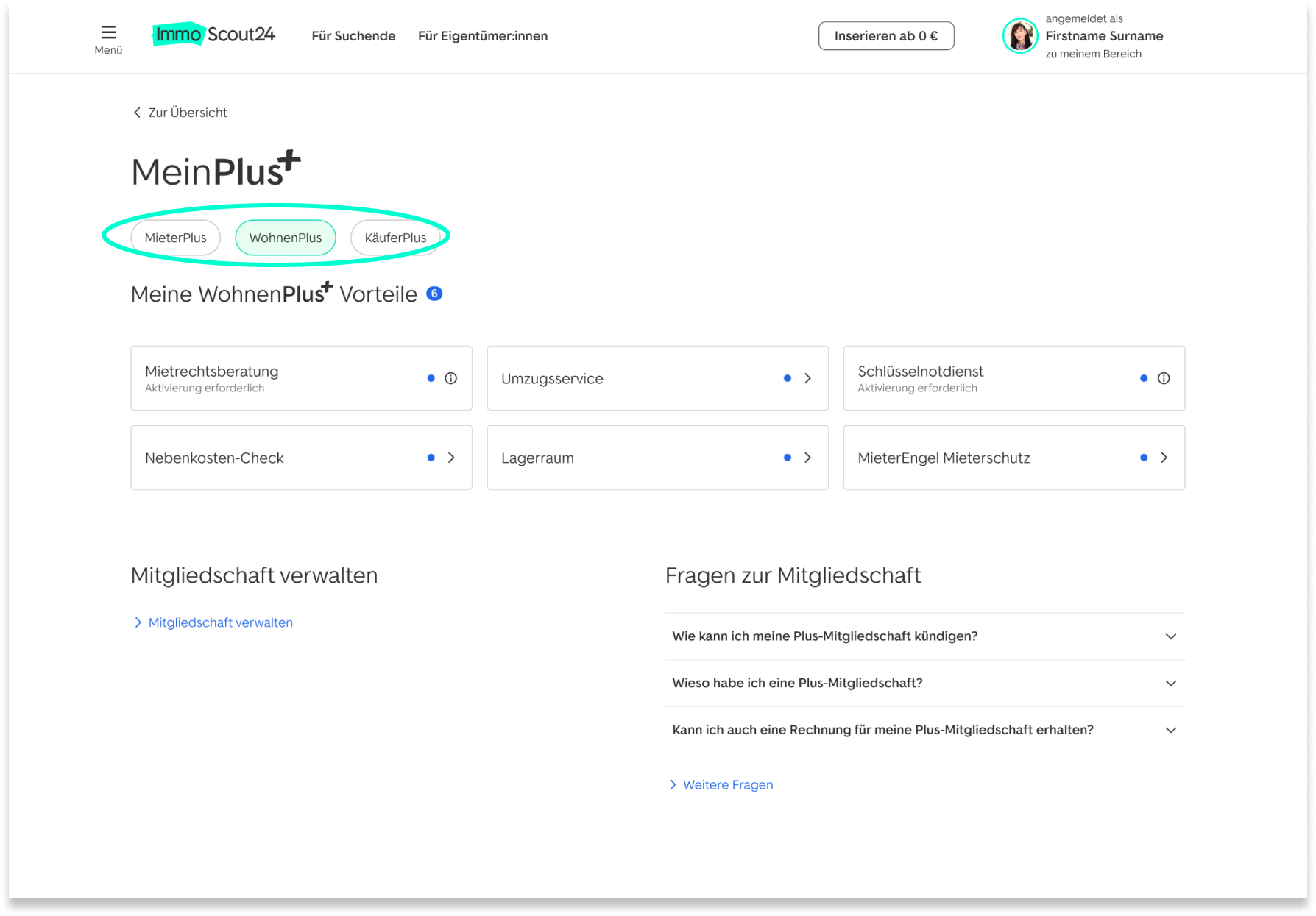
After: LivingPlus features now live under the LivingPlus tab, making it easier for users to find their features.
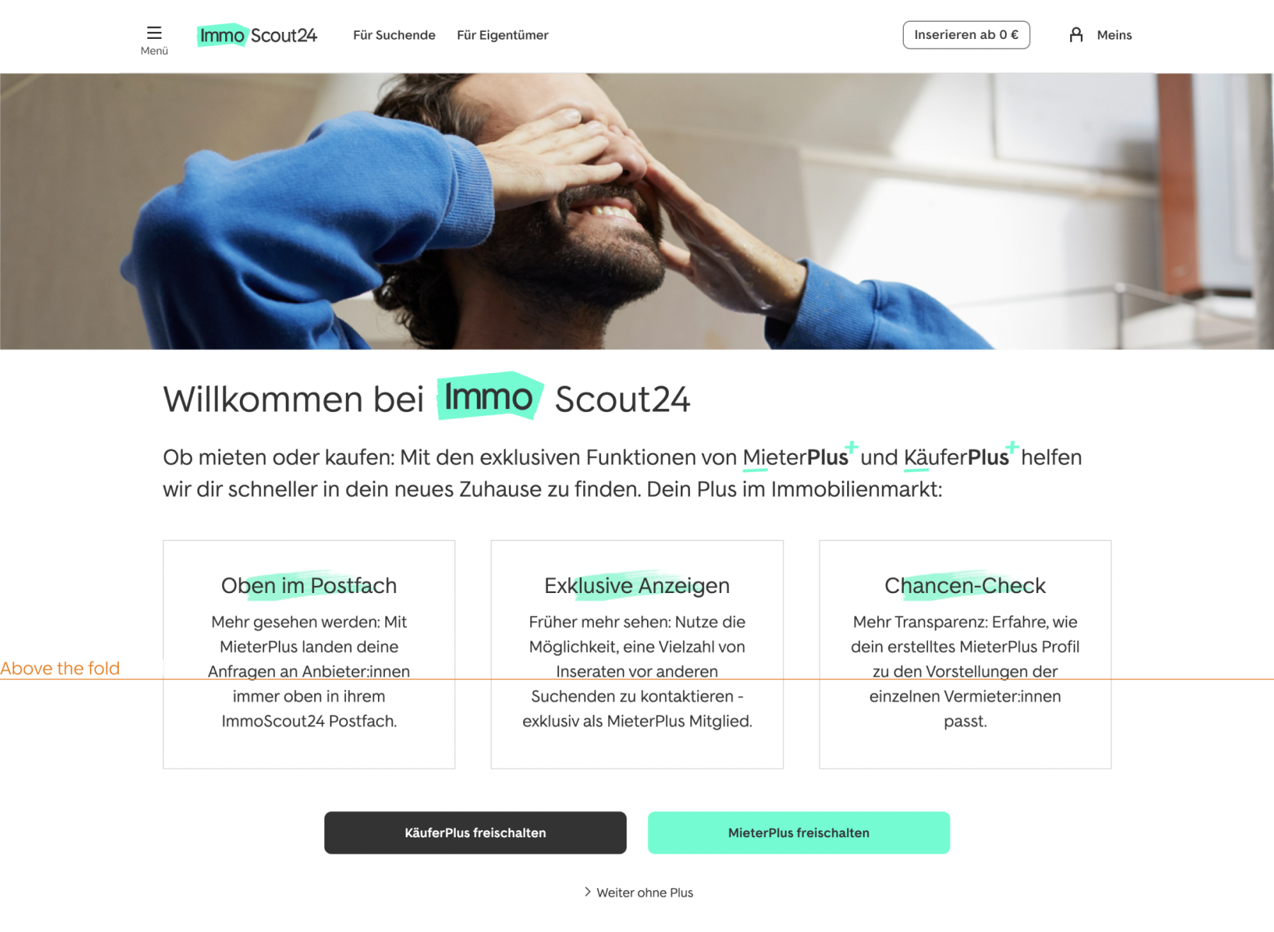
Before: The original page following registration doesn't offer a full overview of ImmoScout24's products and hides the CTAs under the fold.
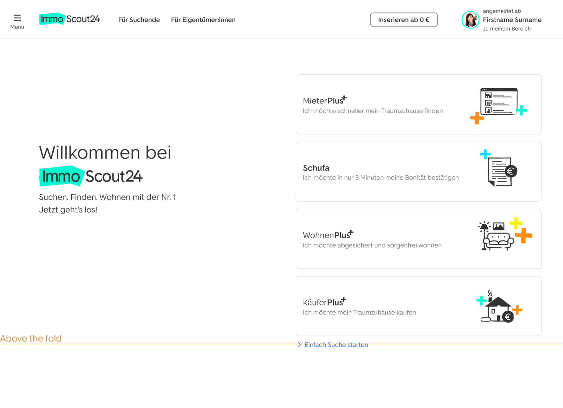
After: I redesigned the page to provide an overview of all products at a glance, including an entry point to LivingPlus.
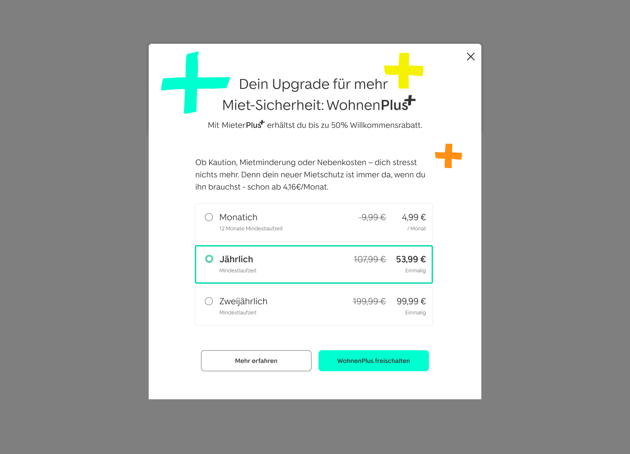
To test if users are interested in LivingPlus upon purchase of the property search membership, we introduced an upsell offering with a welcome discount.
Before
All these changes led to rapid market adoption and the acquisition of a +90% paid subscribers within the first year.